有善植者种下满园牡丹,花开时节邀人前来观赏,却只留下最美的一株,其他悉数除去。友人不解,善植者淡然道:繁花乱眼,静赏只需一株。中国古代哲学有一个原理,最大的“无”,也是最大的“有”,即“淡”。任何艺术走到极致,都会以淡、简的方式出现。
Some good planters have planted a garden full of peonies. When they bloom, they invite people to come and see them, but they keep only the most beautiful one and get rid of all the others. Friends do not understand, good planting indifferent way: flowers disorderly eyes, static appreciation only one. There is a principle in ancient Chinese philosophy that “as within, so without”, that is “lightness”. Any art goes to acme, can appear with light, simple way.
“壳”的设计,即源于斯。
“Shell” Design Inspiration
2020广州设计周,参展品牌恒河沙数。作为展区中的展厅,若是故弄玄虚,深藏不露,在有限的时间、海量的选择面前,游客未必乐意一探究竟。若是门户大开,一览无遗,游客在进入之前,在心理上已将之逛完,驻足时间必然短且不会深入。
There are numerous brands participating in Guangzhou Design Week 2020. As the exhibition hall in the exhibition area, if it is mystifying and hidden, in the face of limited time and massive choices, tourists may not be willing to explore. If the door is wide open and unobstructed, the tourists have mentally finished the tour before entering, and the stop time is bound to be short and not deep.
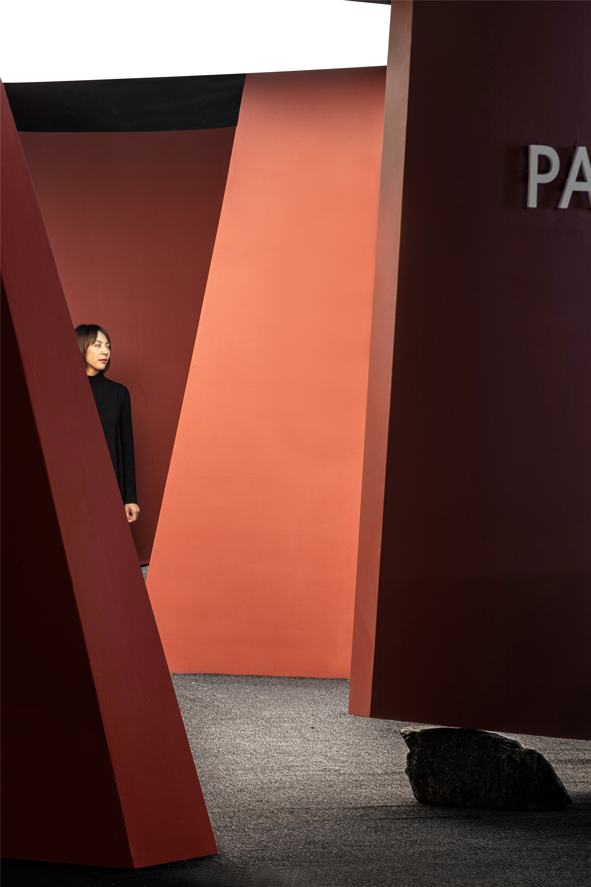
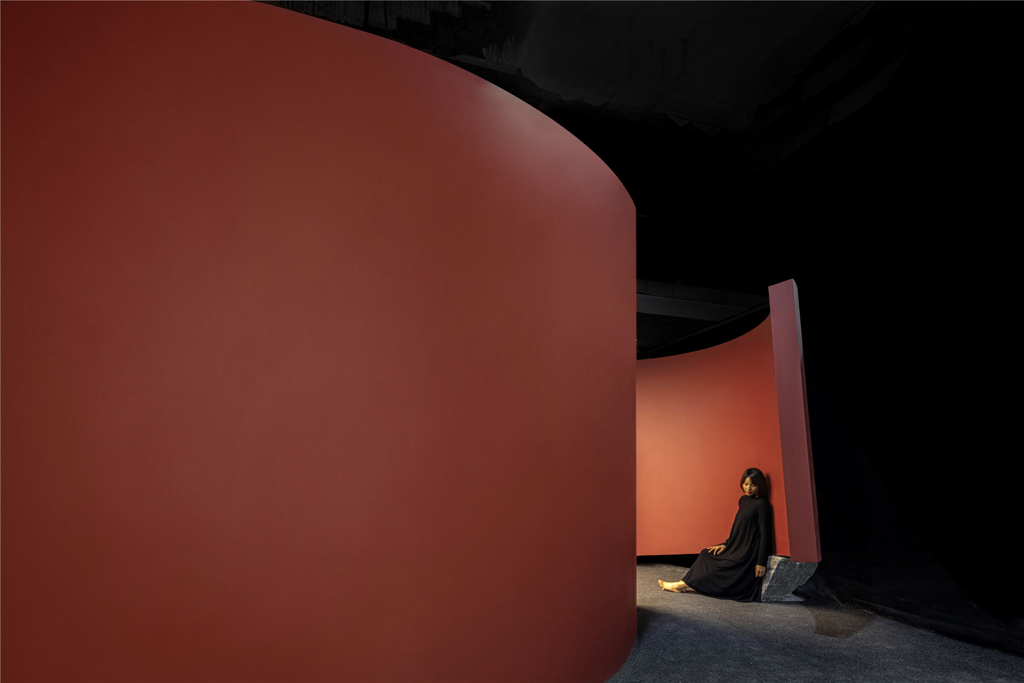
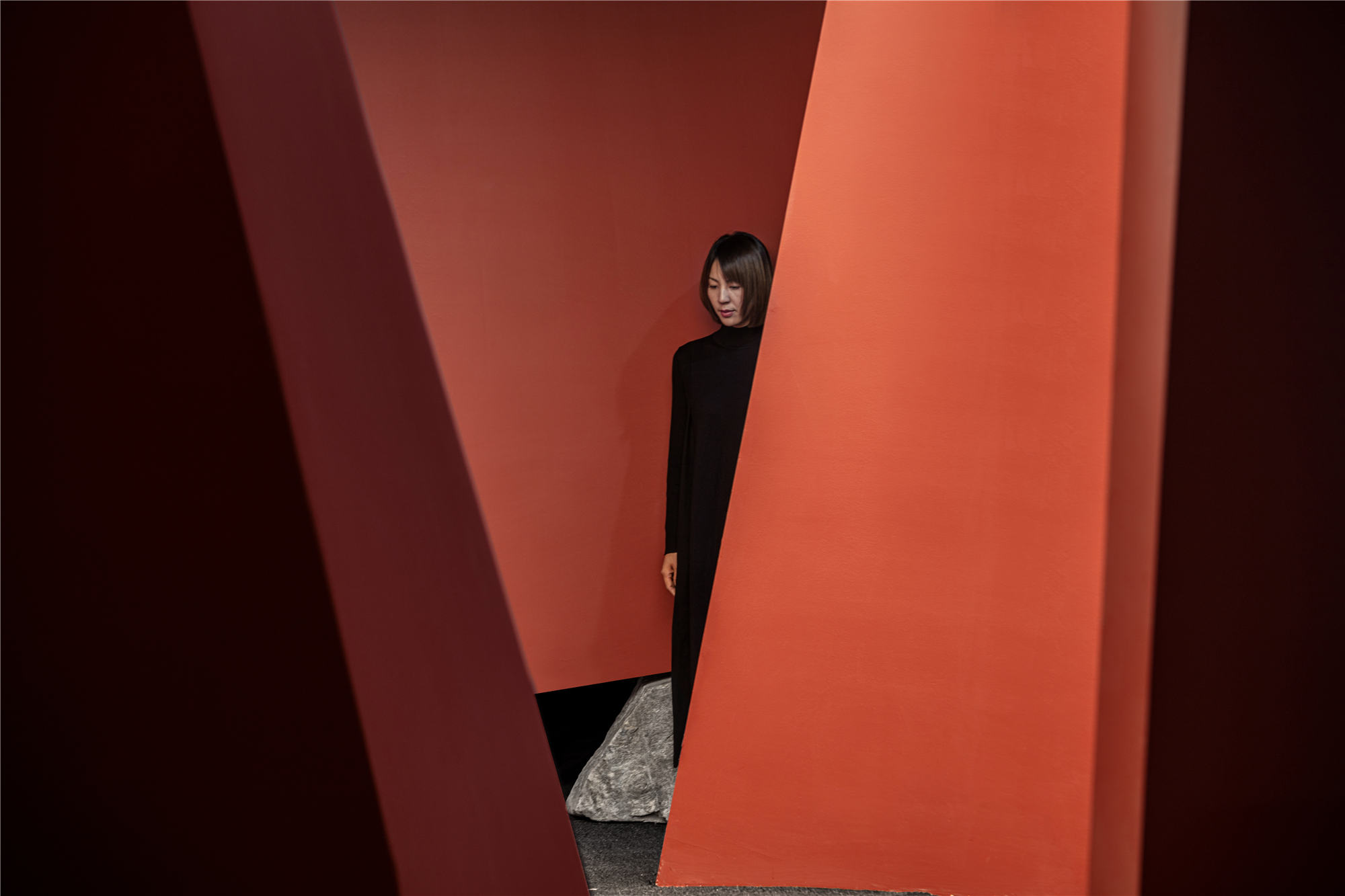
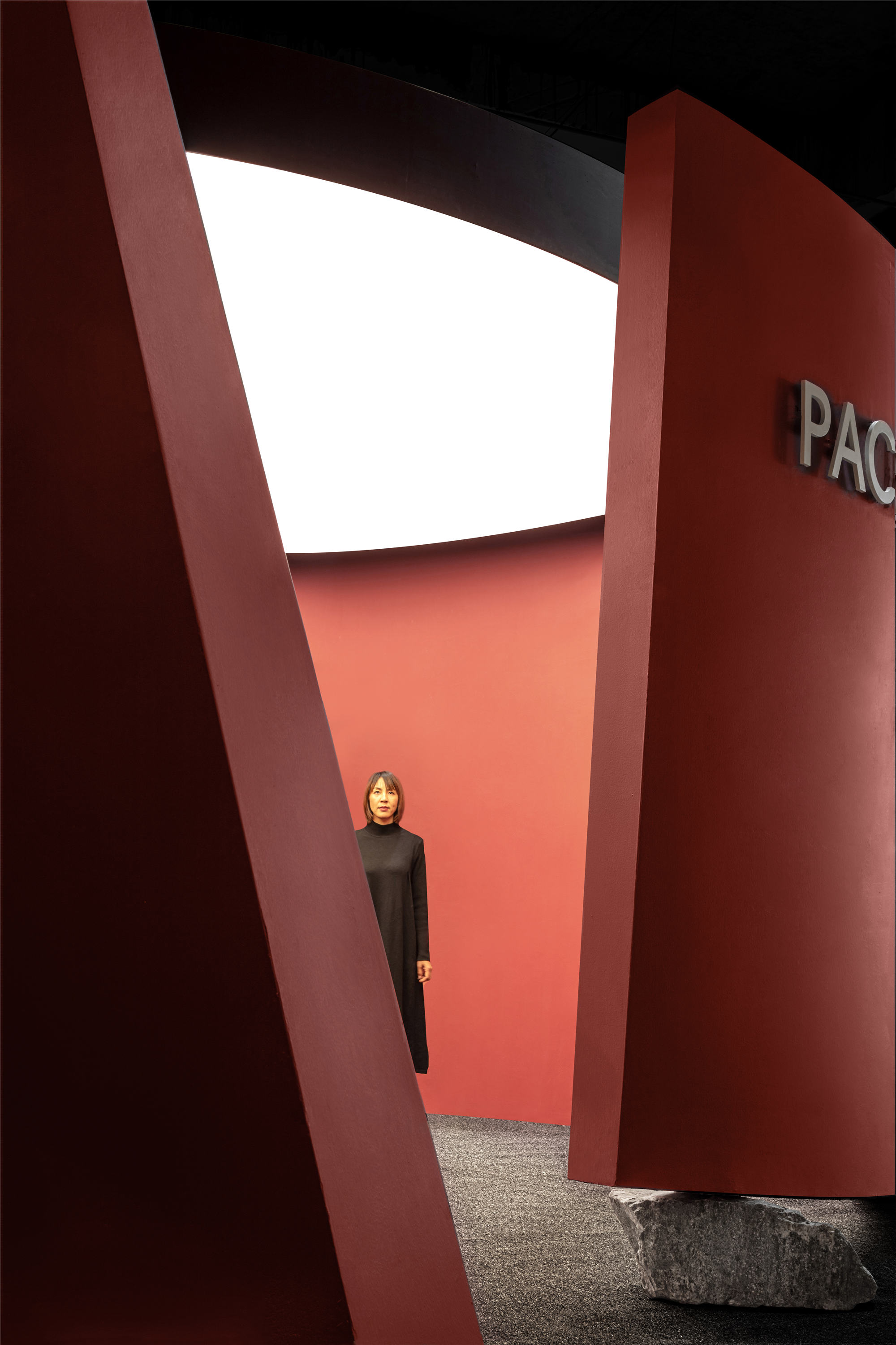
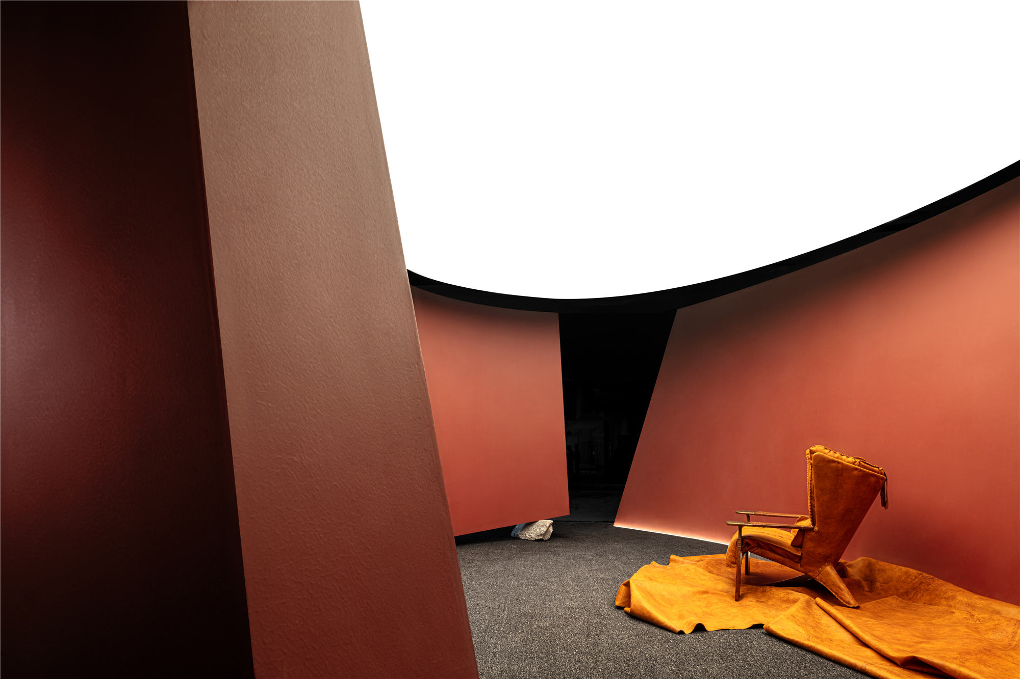
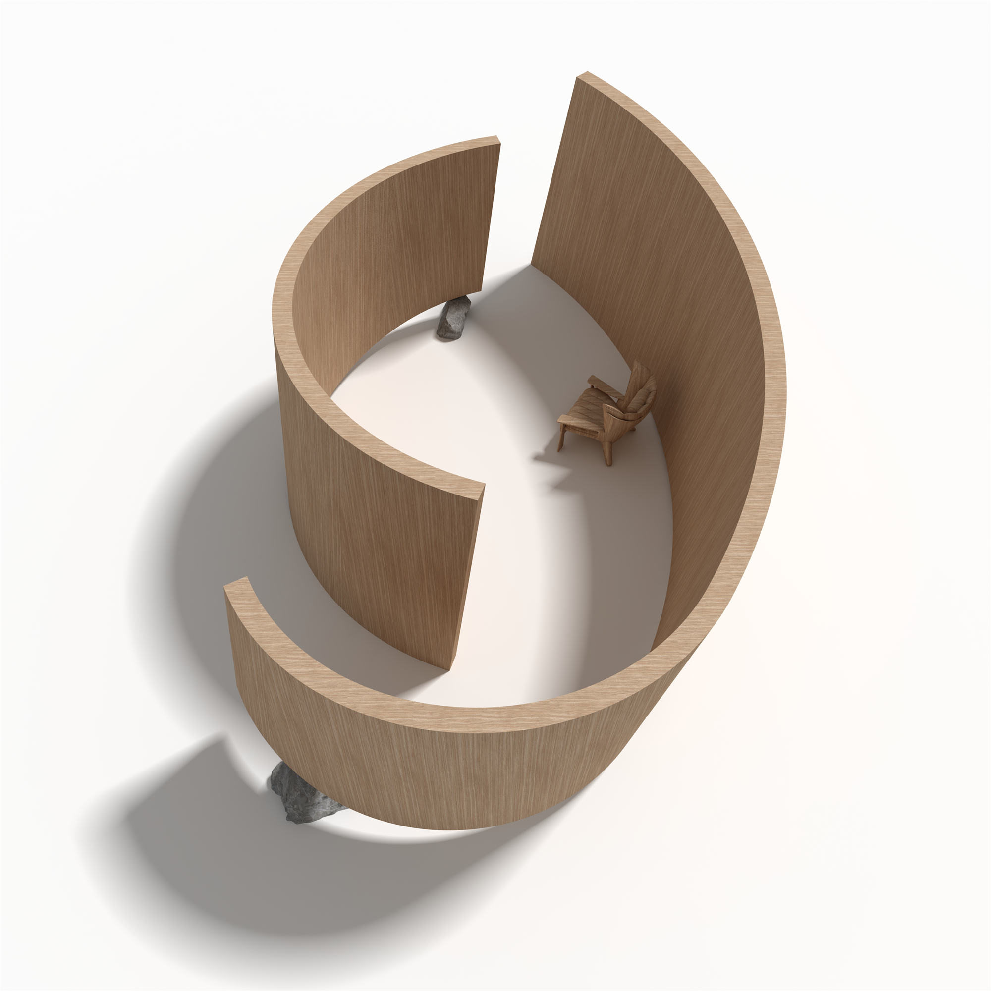
由是,“壳”展厅围而不合。可见之景,在隔与不隔之间,以神秘之相,诱人深入。空间路径是唯一的,采用先扬后抑的手法,无须刻意引导,游客可自主闲步:进入空间,即抵展厅腹地,视线豁然开朗,而另一端通道被刻意收窄拉长,待漫步而出,再得忽然之释放。
Thus, the “Shell” exhibition hall around and not. Visible scenery, in between and not between, with a mysterious phase, inviting deep. The space path is the only one, using the technique of lifting first and then reducing, without deliberate guidance, visitors can walk independently: when entering the space, that is, when arriving at the hinterland of the exhibition hall, the line of sight will suddenly open, while the other end of the passage is deliberately narrow and elongated, waiting to walk out, and then suddenly release.
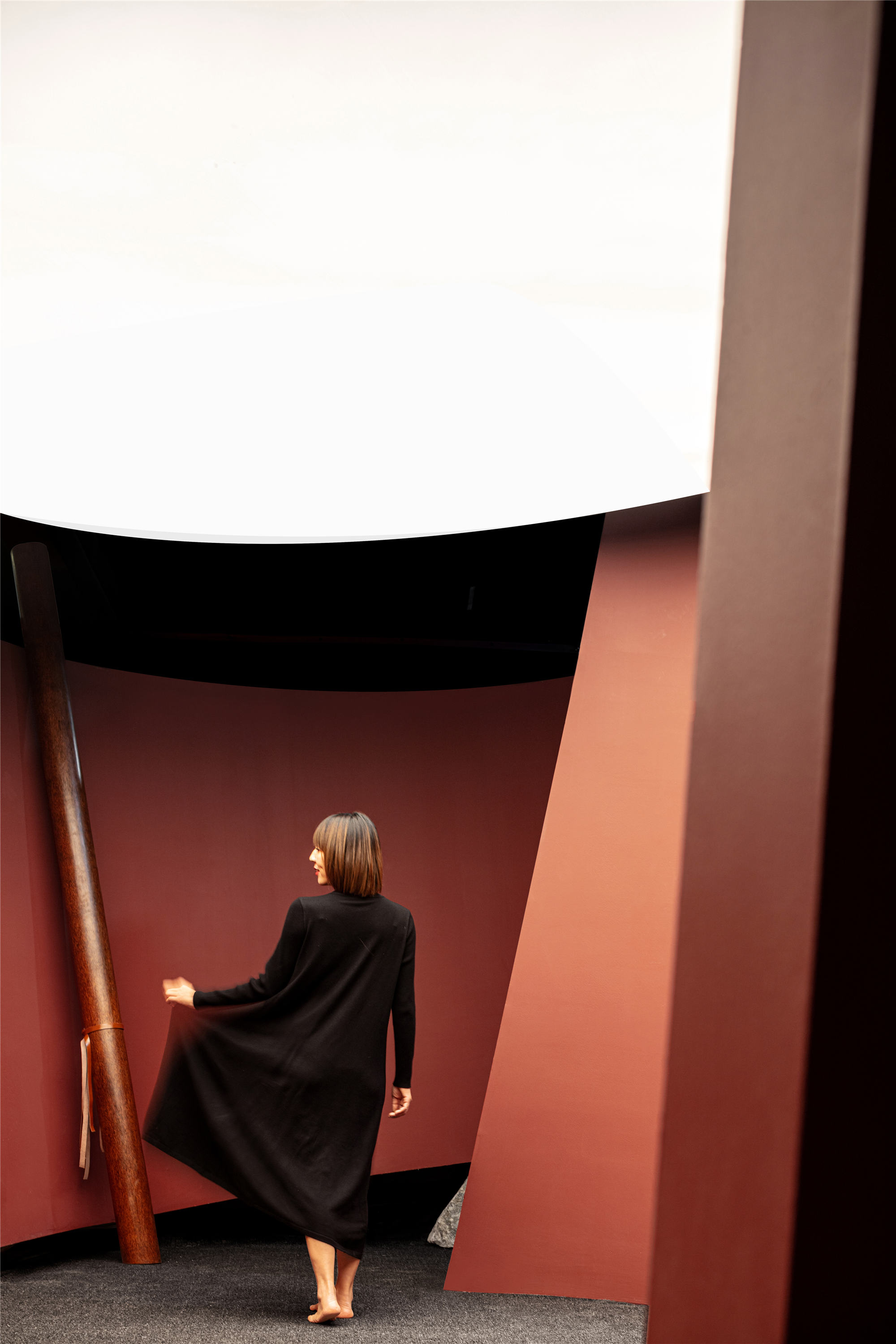
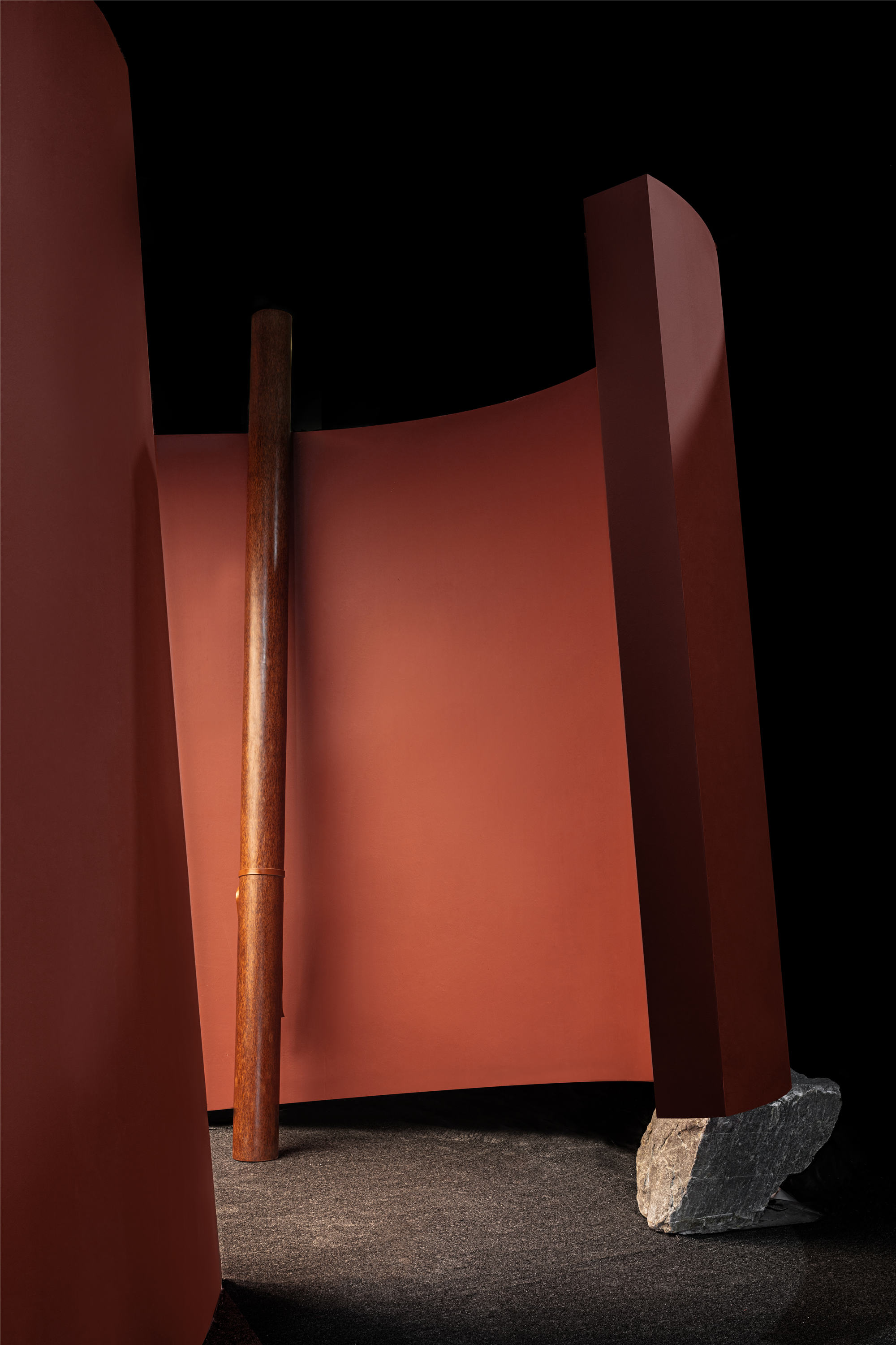
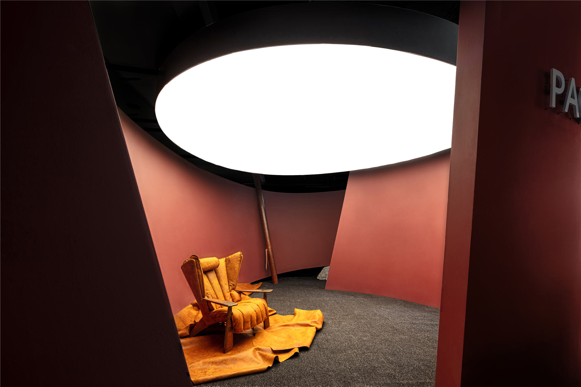
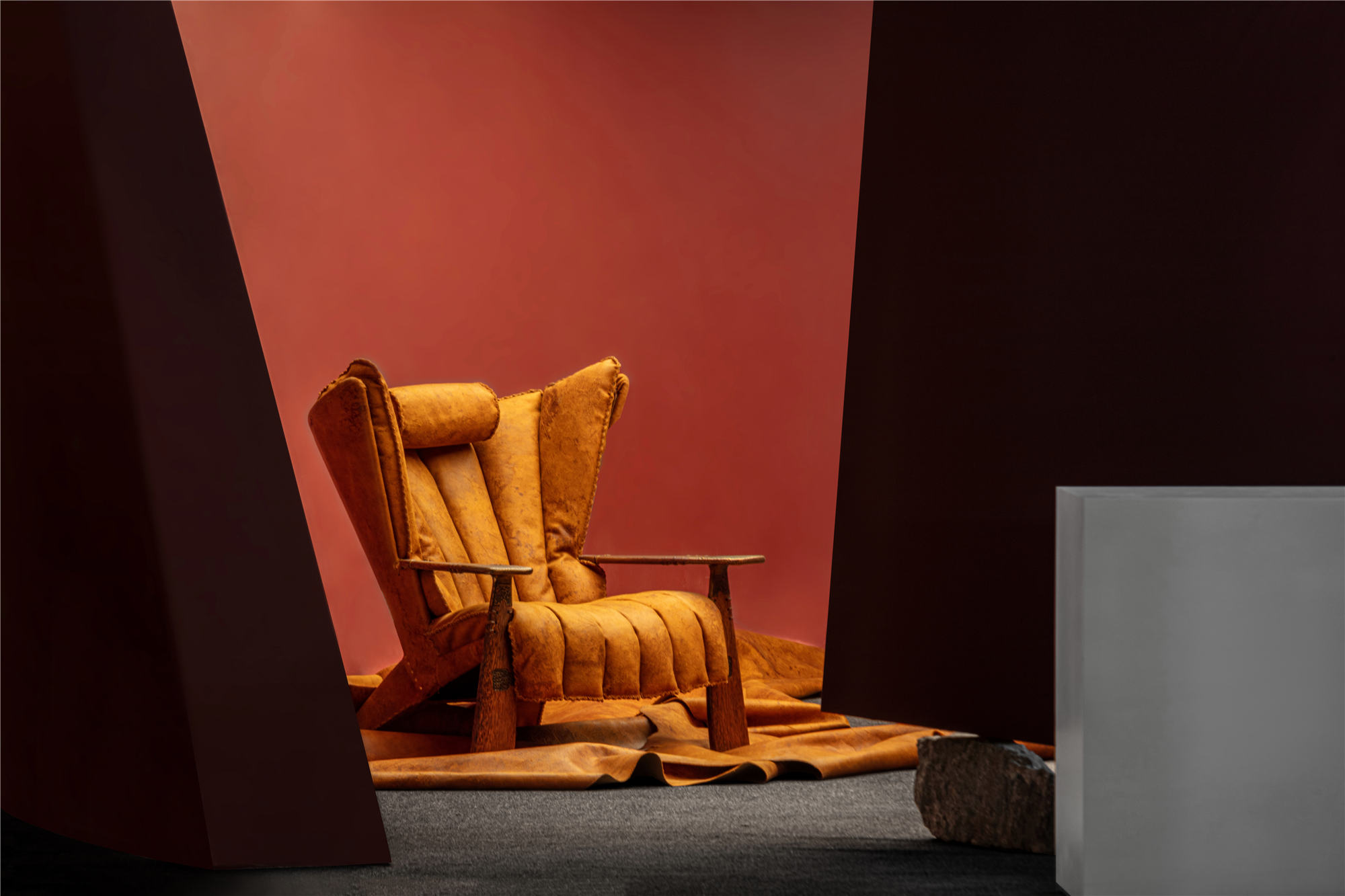
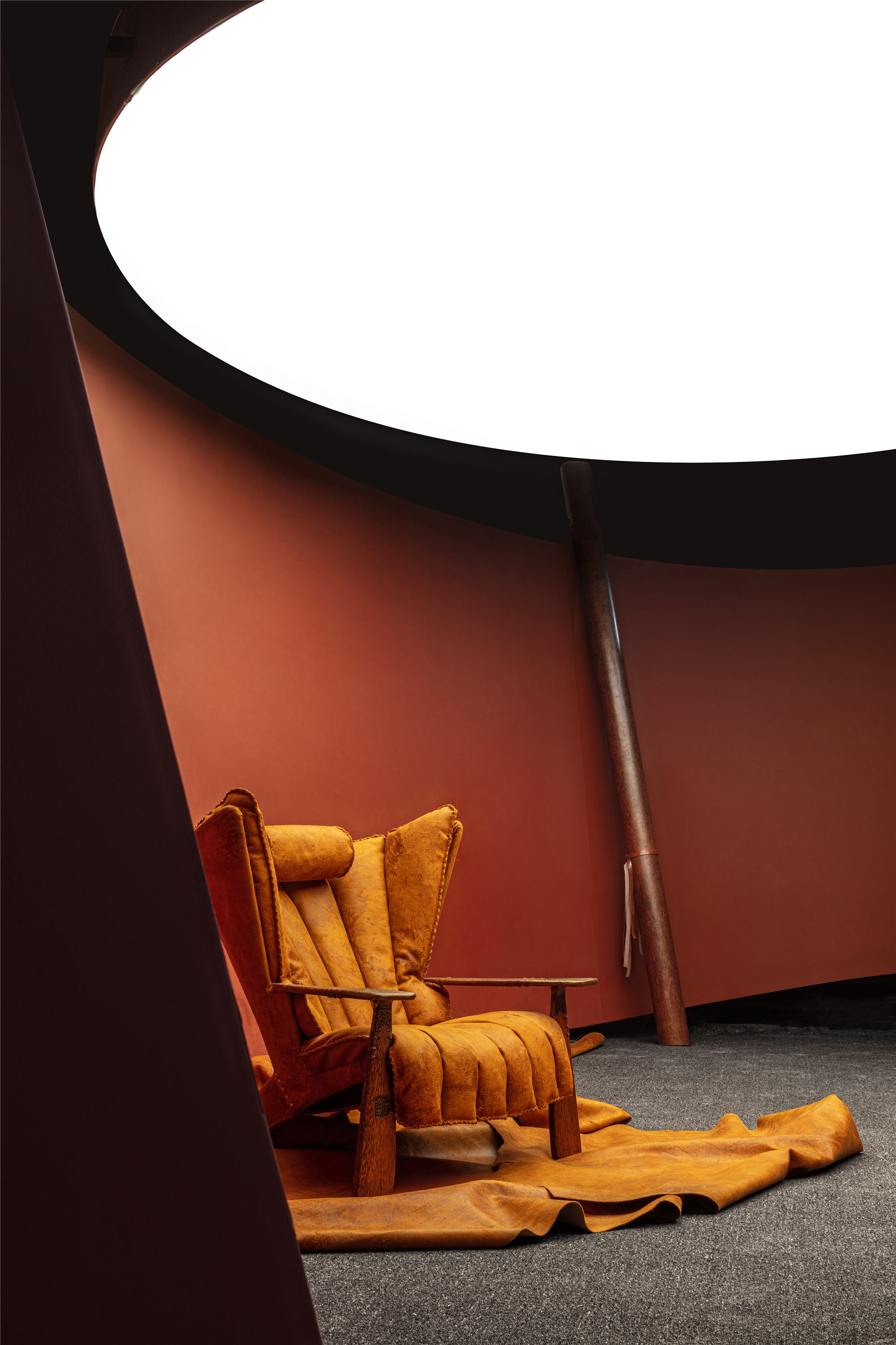
凡经营下笔,必合天地。何谓天地?咫尺之境,上留天之位,下留地之位,中间方立意定景。唯一的展品,既是结果也是过程。设计师将其放置在入口左侧,正着空间腹地。游客信步漫游,可以远望其势,近观其质。
The only exhibits are both the result and the process. The designer placed it to the left of the entrance, directly into the interior of the space. Tourists roaming, can look at its potential, close to its quality.
地壳抬升,河流下切,形成峡谷。峡谷中空,成“壳”腹地。腹地之内,六十年棕榈木作为唯一饰物,映现的是展品用材。木身经手工多次打磨,形成光滑表面。纯天然植物油涂层,经反复涂抹抛光,充分浸透到木纹里,反映出木材的原始风格。
The earth’s crust rises and rivers cut down to form canyons. Canyon hollow, into the “shell” hinterland. In the hinterland, 60 years of palm wood as the only ornaments, reflecting the exhibition materials. The wooden body is polished many times by hand to form a smooth surface. Pure natural vegetable oil coating, after repeated daub polishing, fully soaked into the wood grain, reflecting the original style of wood.
在审美取向上,“壳”追求“素”的“度”。通过对游客行为模式和心理行为的思辨、材料和尺度的精准把握,将品牌特色融入展厅之中,另辟蹊径完成对空间的理解和创造;发挥空间的功能性、自身的展示性和服务于人的属性,使游客达到对空间体验和展品欣赏的统一。
In terms of aesthetic orientation, “Shell” pursues the “degree” of “plain”. Through the speculation of the behavior pattern and psychological behavior of visitors, the precise grasp of materials and scales, the brand features into the exhibition hall, find a new way to complete the understanding and creation of space; Give full play to the space’s functionality, its own display and the attributes of serving people, so that tourists can achieve the unity of space experience and exhibit appreciation.
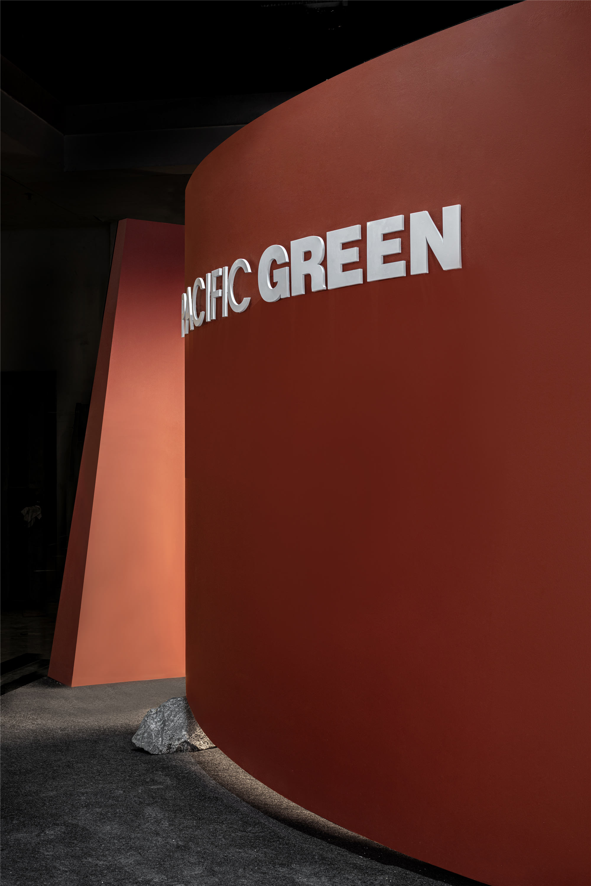
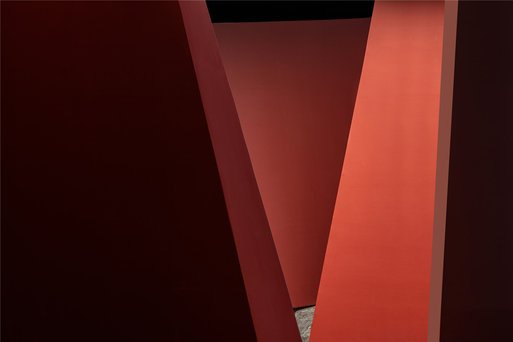
美的形式来自整体与局部、局部与局部之间的呼应。简洁的框架与深沉的着色,凸显空间的独立性。细部构建的精致,体现为比例与尺度的权衡。在造型秩序上,采用曲与直、虚与实、动与静达至平衡,形成流动的状态。
The form of beauty comes from the response between whole and part, part and part. Simple frame and deep coloring highlight the independence of the space. The delicacy of detail construction is reflected in the balance of proportion and scale. In terms of shape order, the balance between curvature and straightness, between void and solid, between dynamic and static is adopted to form a state of flow.
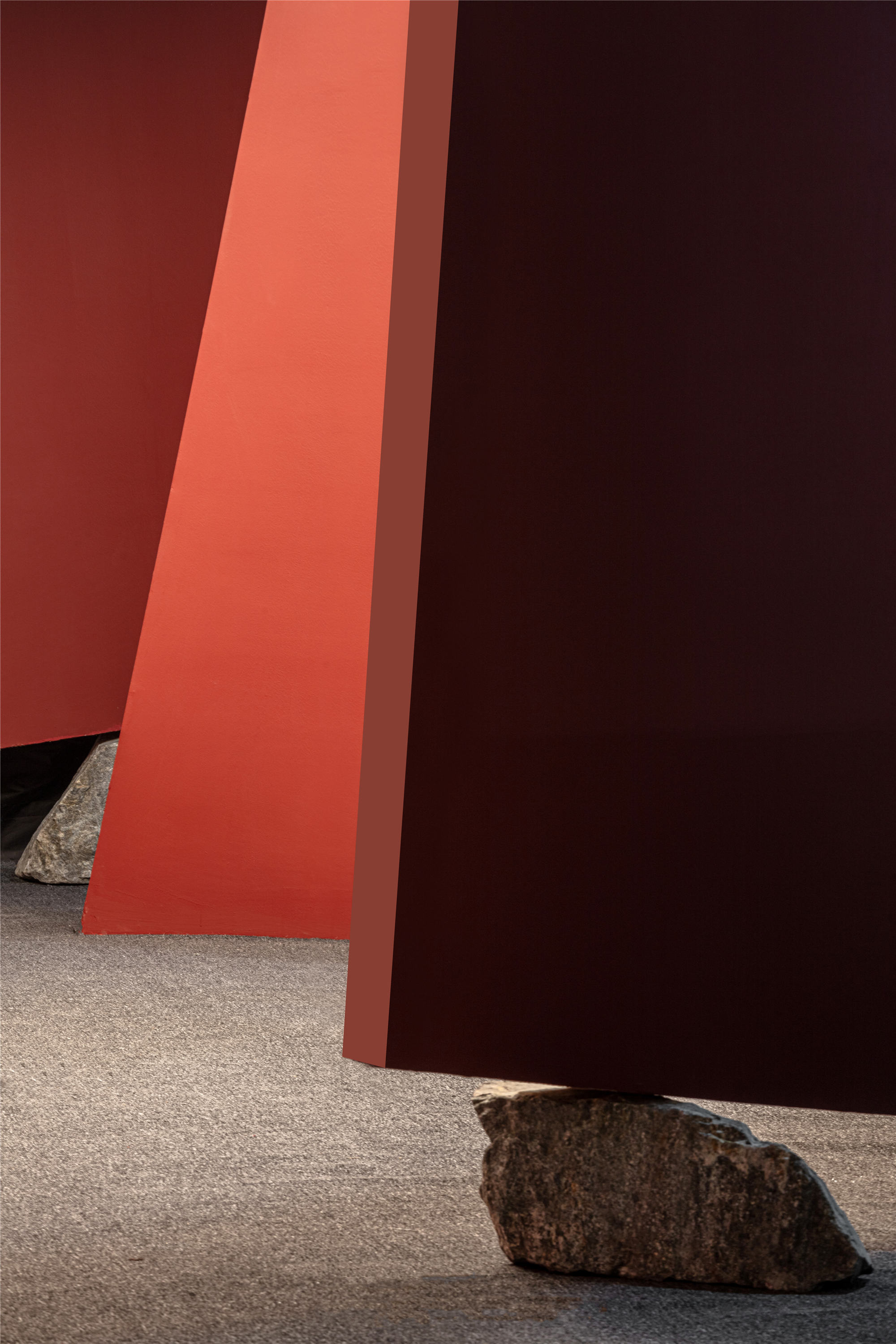
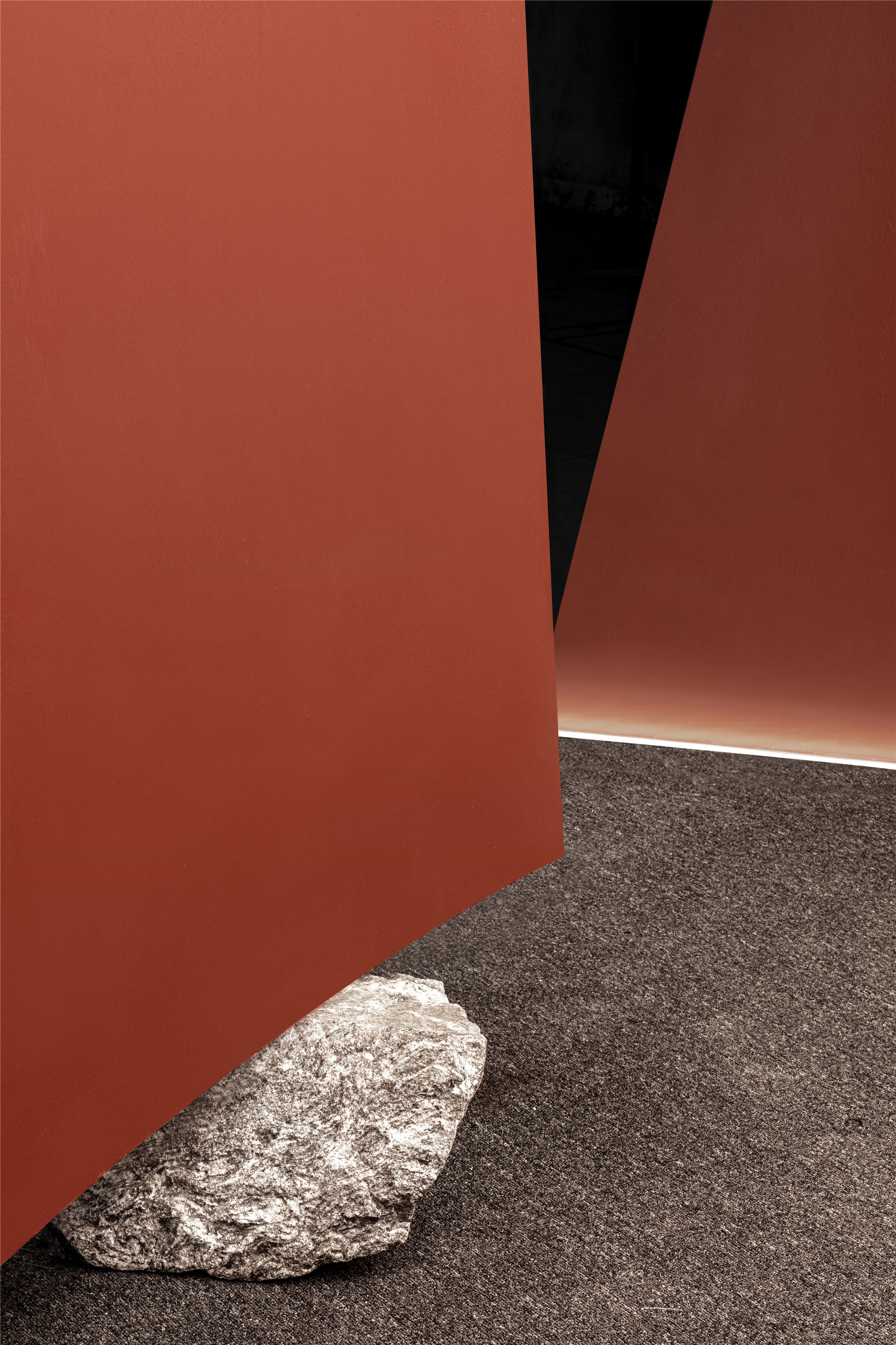
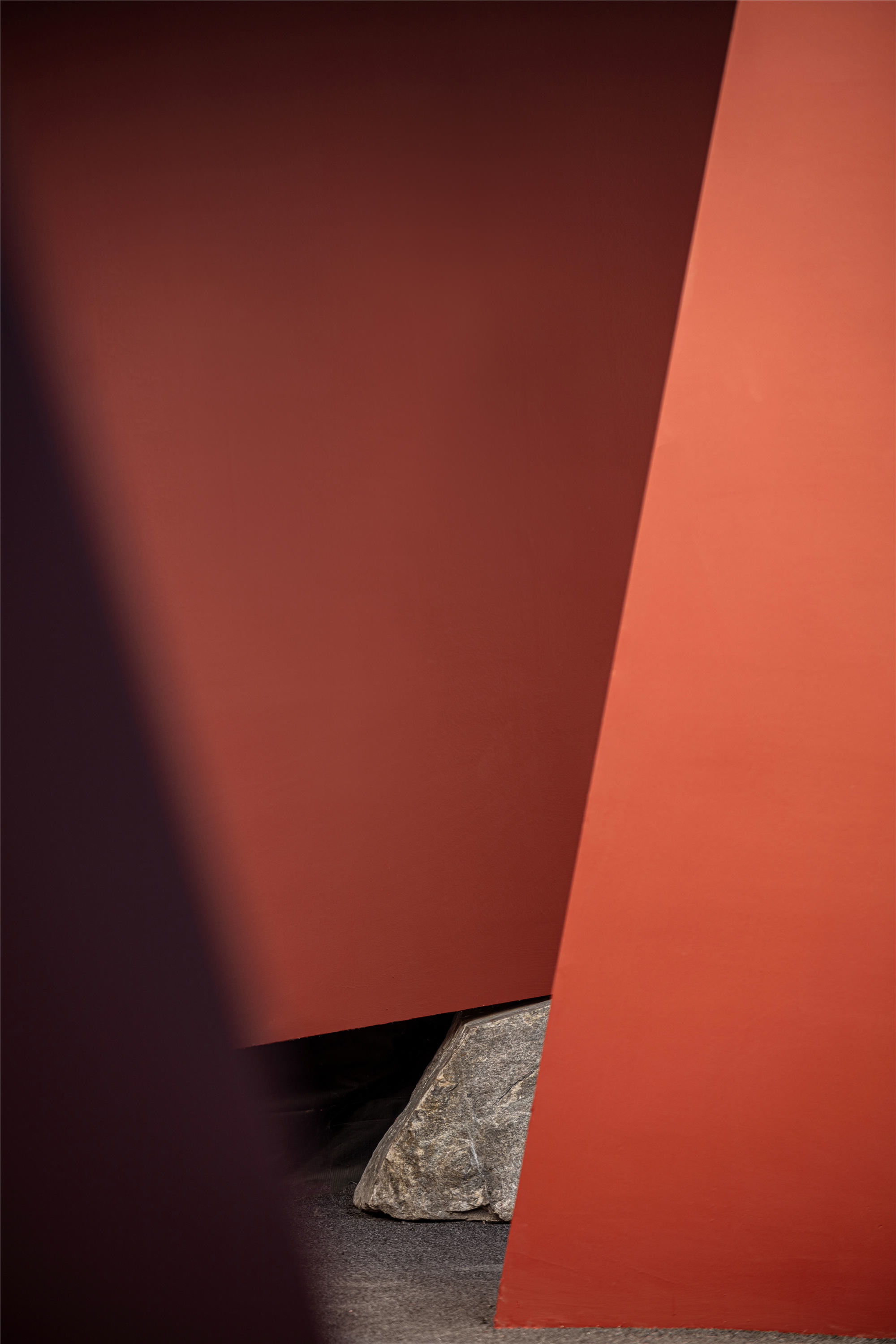
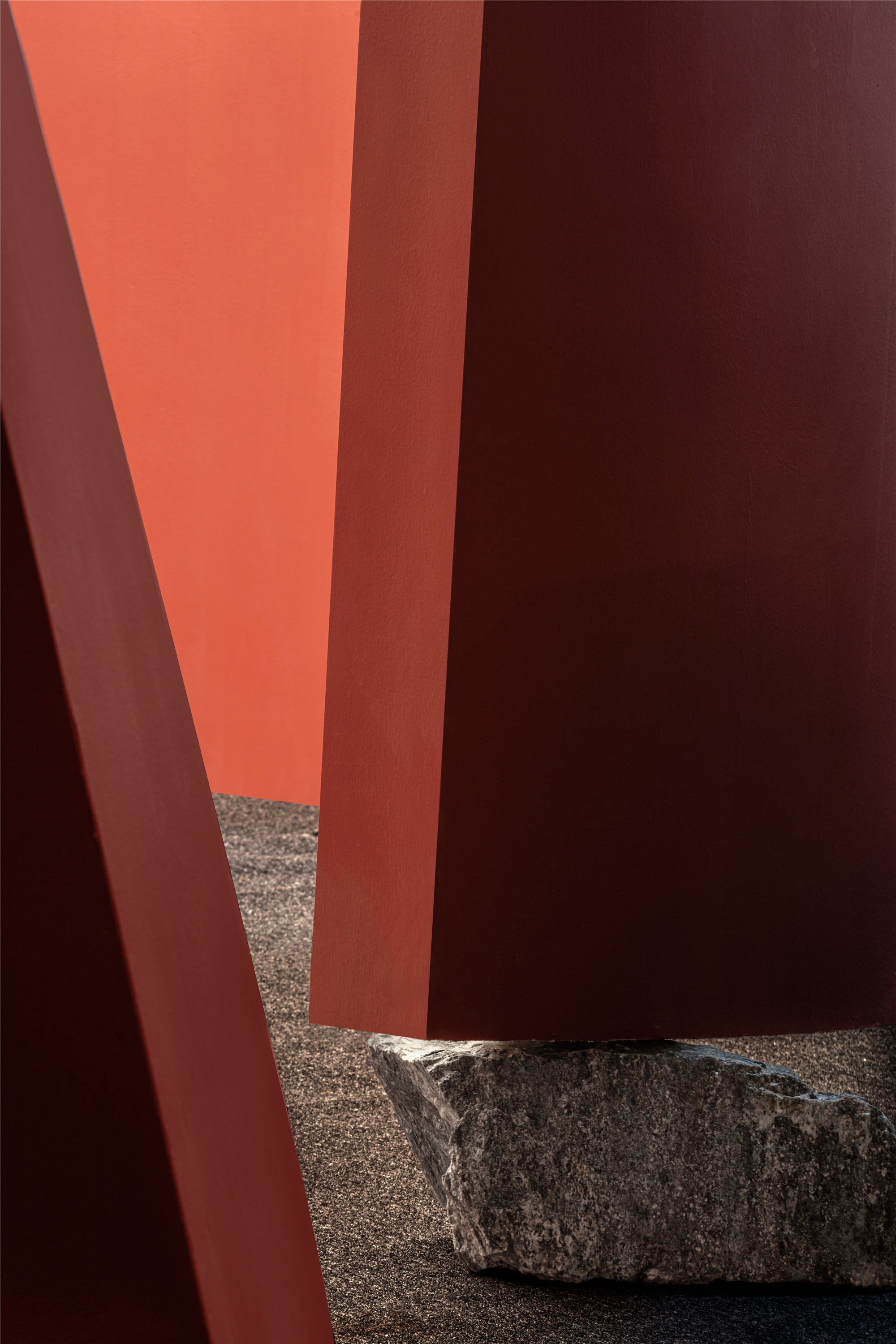
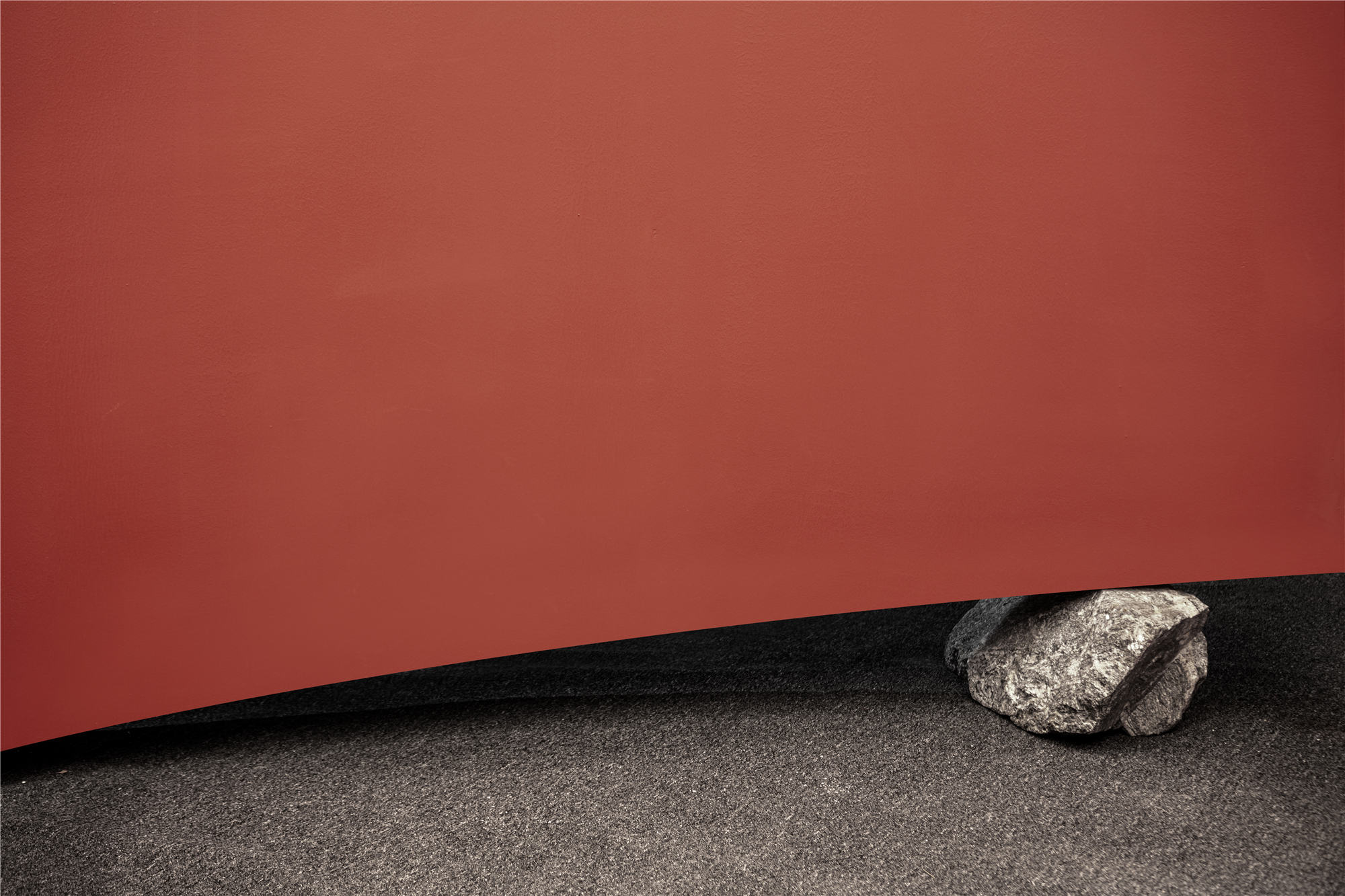
造型线条与漫游路径呈现为两曲三折,节奏与韵律统一于整体之中;展墙两端翘起,表现为上升力与下切力之间的抗衡;原石作为隐匿性的设计元素,既是支点之所在,亦是自然延伸的物象。
Modeling lines and roaming paths are presented as two songs and three folds, and rhythm and rhythm are unified in the whole. The two ends of the exhibition wall are warped, showing the counterbalance between the rising force and the lower shear force; Raw stone, as a hidden design element, is not only the place of fulcrum, but also the natural extension of the image.
壳,是自我保护的边界。对于软体动物,壳就是天,就是地。
The shell is the boundary of self-protection. For mollusks, the shell is the sky and the earth.
壳,是自我冥想的空间。对于都市游灵,壳就是器,就是道。
The shell is a space for self meditation. To the city tour spirit, the shell is the device, is the way.
现代社会,谁没几个壳?设计师极尽简约之能事,执着于造一个“壳”以安放一件展品,是因为设计能做的,往理性说,是通过管理人的视角与行为,引导人以新的视角去看待身边的事物,往感性说,是创造一个可虚可实的场景,照存或者安放当代人的情绪。
In modern society, who does not have a few shells? The designer tried his best to make everything simple, insisting on creating a “Shell” to hold an exhibit. What design can do, rationally speaking, is to guide people to look at things around them from a new perspective through the perspective and behavior of managers; perceptually speaking, it is to create a scene that can be false but can be real, and to store or place the emotions of contemporary people.
在动态的展厅之中,围绕展品营造出一个静态区,设计师期待游客能静下心来,跳出身之所容、目之所瞩的有限天地,以意游于无限天地之外,大到宇宙洪荒,小至芥子世界。无论是透过现象看本质,还是掠过本质看现象,随你所愿。这是一个品牌展示的空间,亦是安顿情绪、安顿想象的空间。
In the dynamic exhibition hall, a static area is created around the exhibits. The designer expects visitors to calm down, jump from the limited world where they can see, and travel beyond the infinite world with their intention, ranging from the universe to the mustard world. Whether you look at the essence through the phenomenon, or look at the phenomenon through the essence, as you wish. This is a space for brand display, but also a space for settling emotions and imagination.
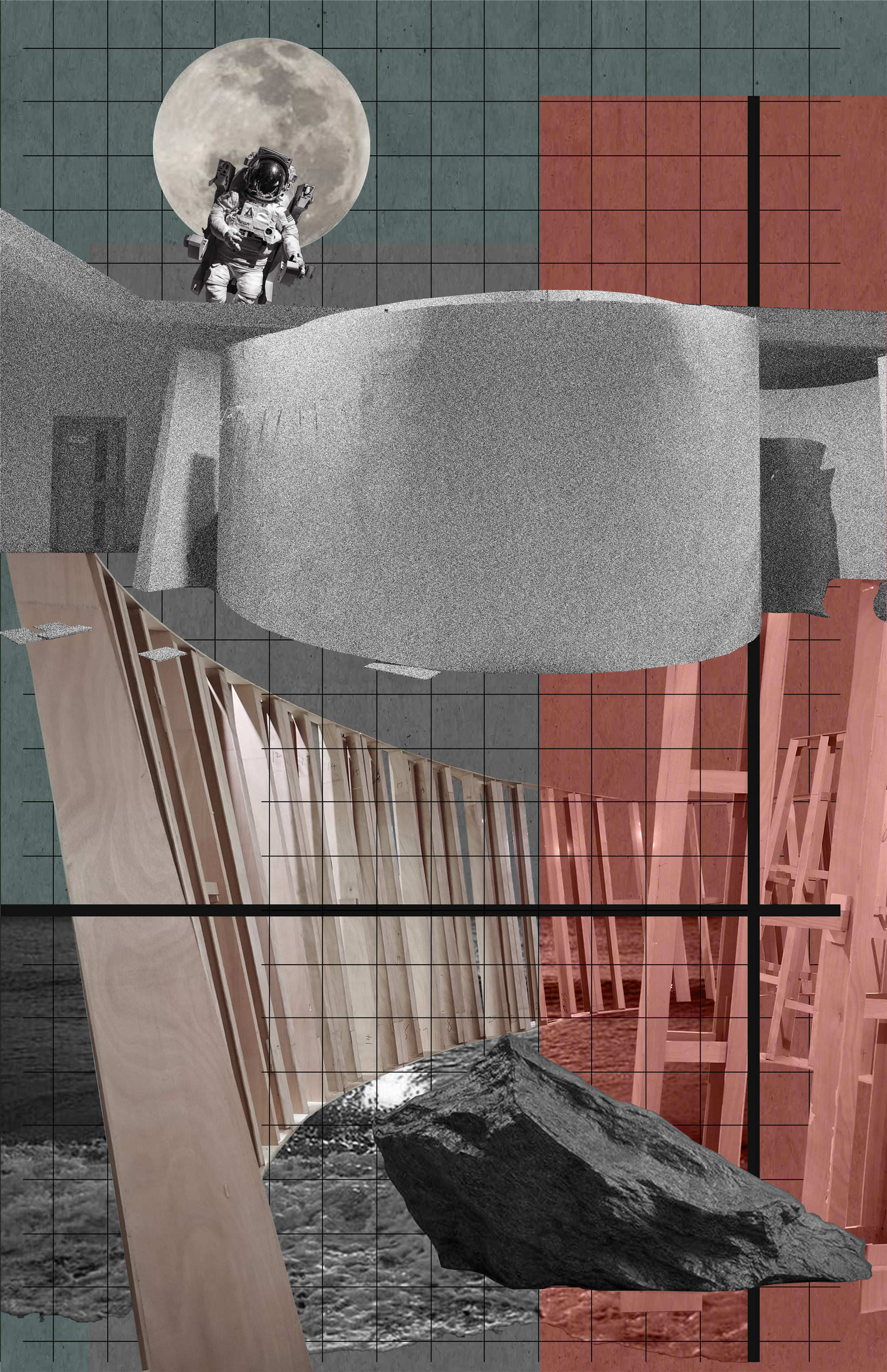
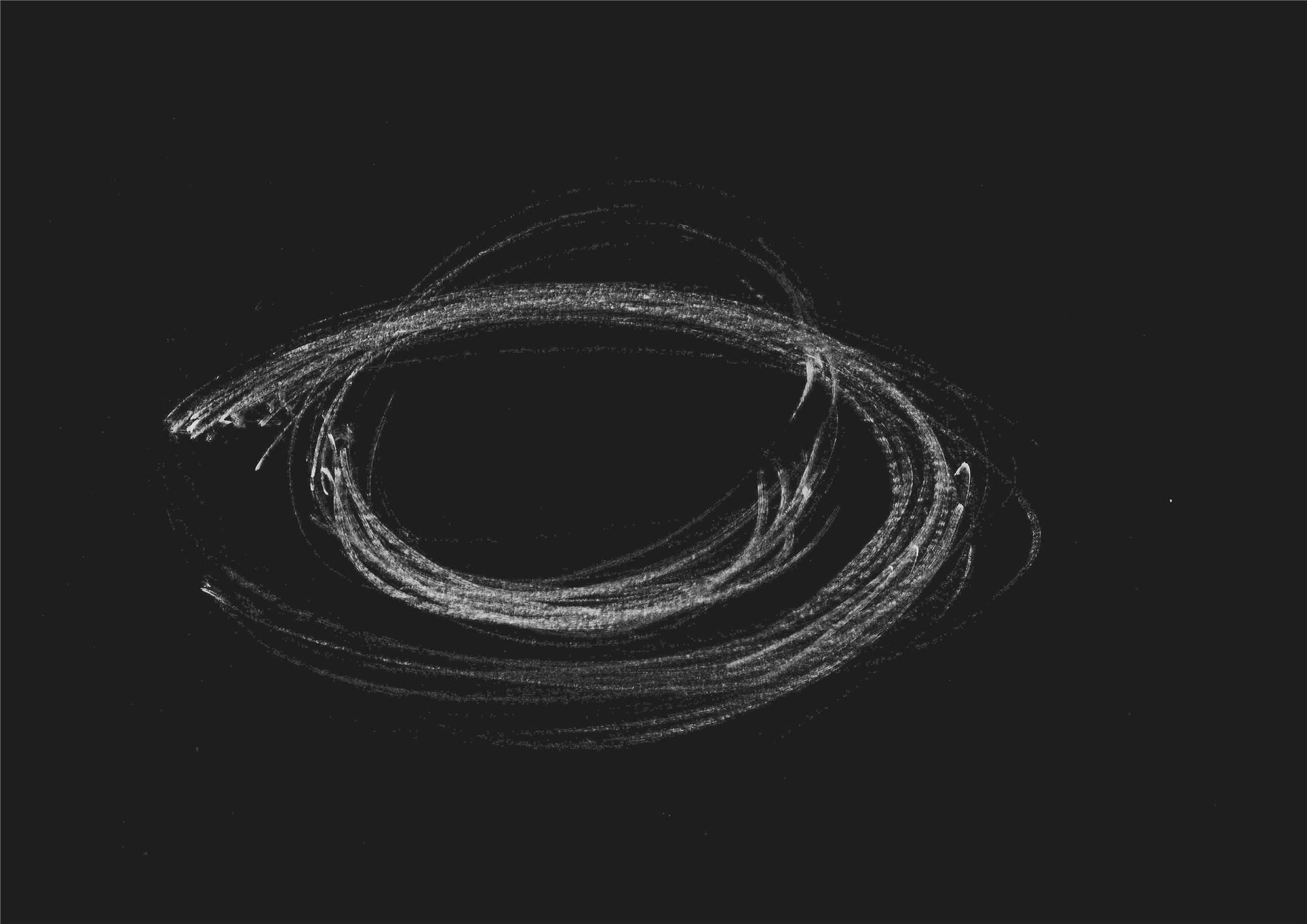
▲概念
▲鸟瞰图
▲施工现场
▲手绘草图
项目信息——
项目名称:PACIFIC GREEN
项目地点:广州设计周
项目业主:惠州金棕榈家具有限公司
完成时间:2020年12月
室内设计:壹席设计事务所
主案设计:胡涛
设计团队:周严杰、尹咏娴、林武源、唐小渡
项目摄影:陈铭
特别鸣谢:SIKI石客照明︱陈泳海
Project Information——
Project Name:PACIFIC GREEN
Project Location:Guangzhou Design Week
Project Owner:Huizhou Jinzonglv Furniture Co., Ltd.
Completion Date:December 2020
Interior Design:ONE DESIGN OFFICE
Chief Designer:Huson
Design Team:Zhou Yanjie, Yin Yongxian, Lin Wuyuan, Tang Xiaodu
Photographer:Chen Ming
Special Acknowledgement:SIKI Lighting | Chen Yonghai


