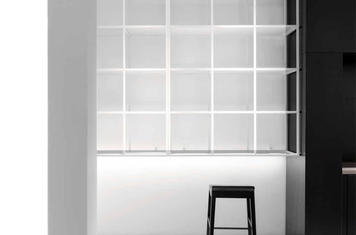
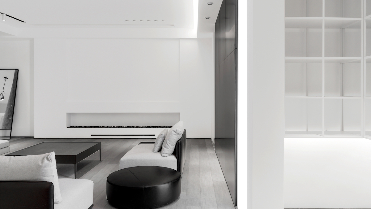
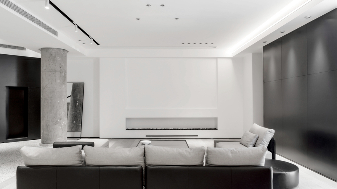
用心感受空间,空间里的空间有不同的语言和启发。YOUSPACE的设计概念是空间具有可变性,具有可延续性,多组合属性,有与无之间的界限,似乎绝对又似乎模糊。
When you feel the space with your heart, you could sense a different form of language and inspiration within the space itself. YOUSPACE’s design concept is that the space has variability, with continuity and multiple combination of other properties. The line between having and not having seems to be absolute as well as blurred at the same time.
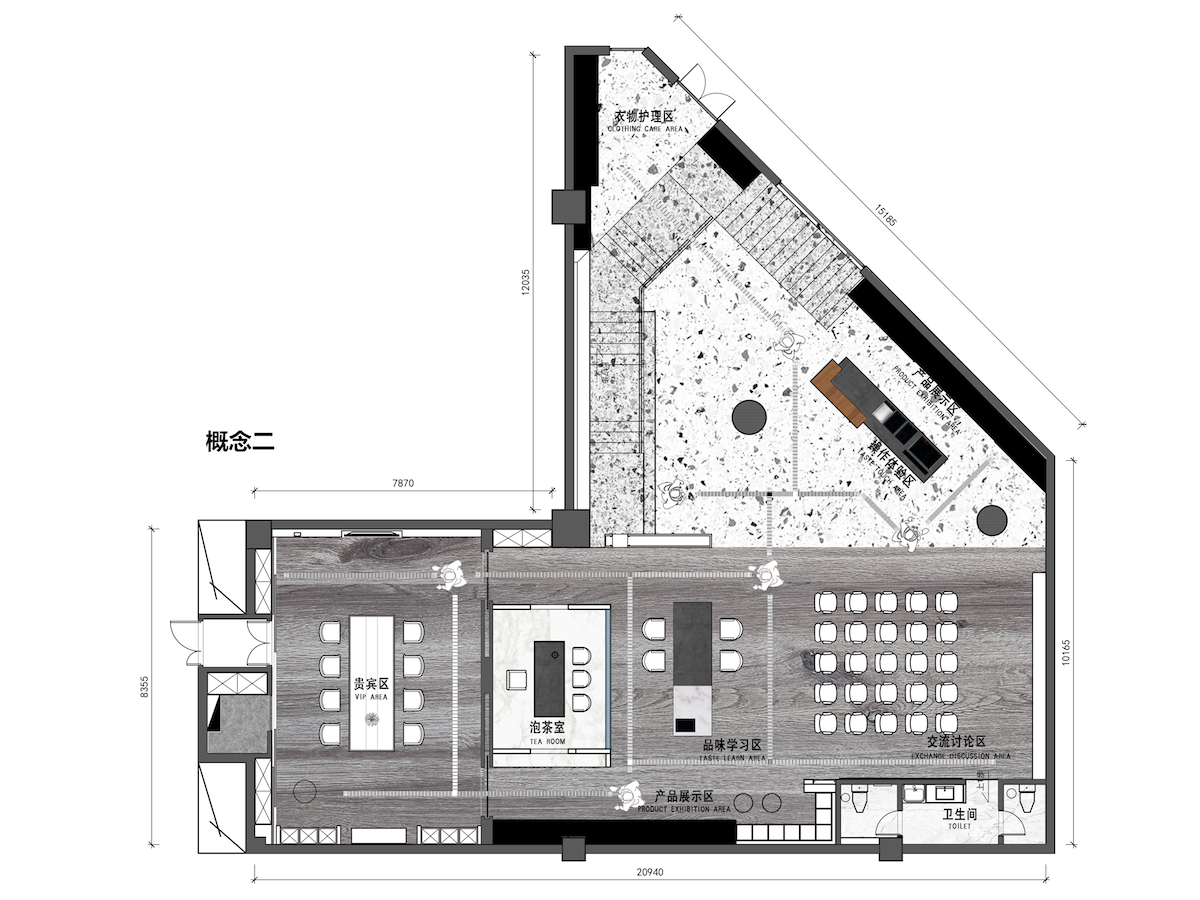
项目地理位置位市中心购物商城的一楼和负一楼的过度空间,是一个独立展馆。原始建筑结构是异形不规则的。天汇设计在对该场地的多次解读后,从功能的角度,决定将从简处理,重心转移到人在空间的体验感,和空间功能最大化。
The project itself is located in the transitional space between the ground floor and the first floor of the downtown shopping mall, as a stand-alone pavilion. The original building structure is irregular. After several interpretations of the site, Tianhui Design decided to keep the site simple from a functional point of view, shifting the focus to the human experience within the space to maximize the functionality of the space.
设计过程中考虑光线,视觉,动线,以及空间的互动关系。挑高5.5米的地下建筑结构里有一个长长的楼梯。最低梁高度1.2米,最低的消防主管道1.6米,还有两根直径为0.8米的水泥圆柱。我们通过几次结构拆解,层次剖析和有序重组,决定利用迭代的方式,从大小比例,高低层次,深浅高度,来呈现当下展示空间。
The design process considers light, vision, movement, and the interaction of spaces. The 5.5-meter-high underground structure has a long staircase. The lowest beam height is 1.2 meters while the lowest fire escape is 1.6 meters. There are two concrete columns with a diameter of 0.8 meters. Through several structural disassembles, hierarchical dissections and orderly reorganizations, we decided to utilize an iterative approach. In terms of size proportions, height levels, and shades of height to present the current display space.
▲楼梯区 staircase area
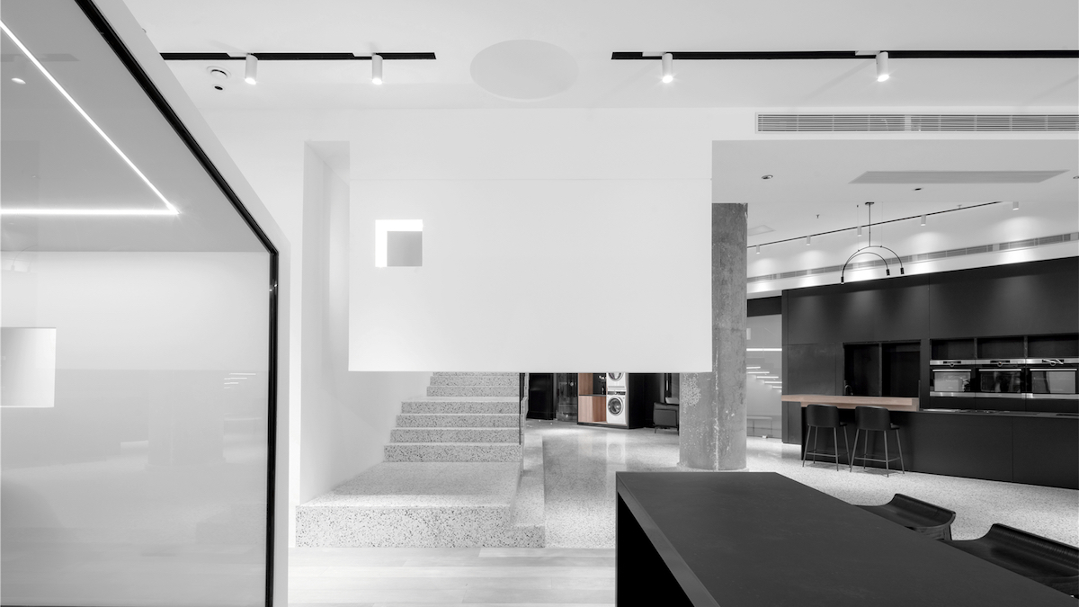
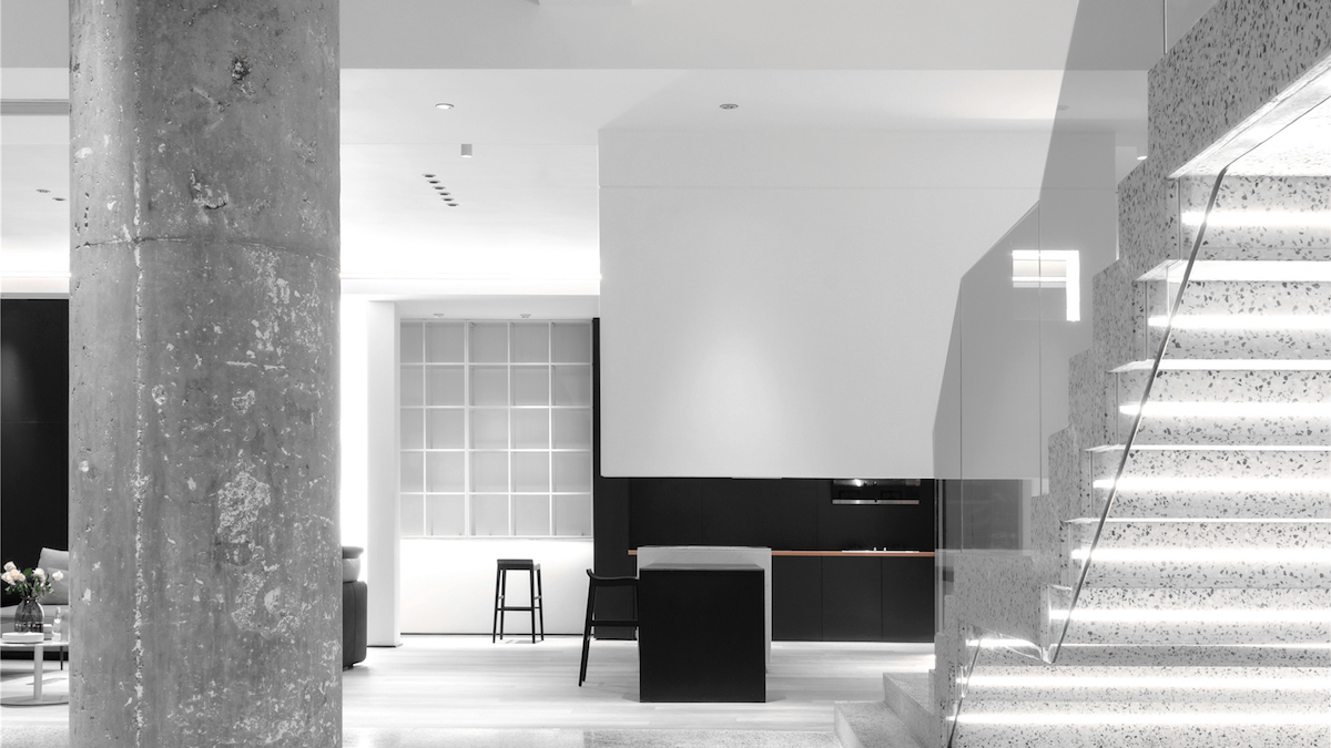
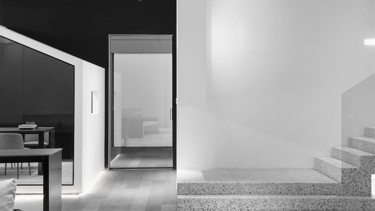
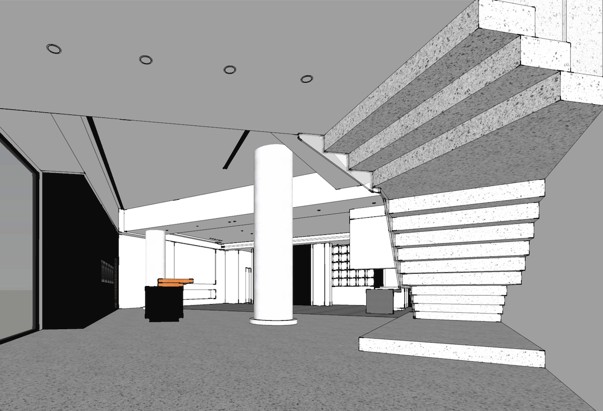
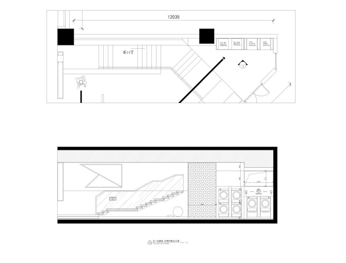
连接5.5米挑高的是一个33步的悬挂楼梯,楼梯平台通过4次分割处理,让每个平台都一个独立的视线框。楼梯的最后的视线墙是一个悬挂的半墙,透过半墙可以看到有一个长形的黑色吧台。也可以看到人从半墙后经过的动态。适当的区域划分和安全感的设定在空间种是极其重要的。楼梯顶部的三角切割,原楼板的水泥面,原梁结构的毛面处理,新筑的水泥漆吊顶。细腻与粗旷、整齐与不束、白与灰、原始与现代、一起在《有间》中关联起来了。
Connected to the 5.5m ceiling height is a 33-step suspended staircase with a platform that is divided four times to give each platform a single staircase of freestanding sight-box. The final sight wall at the end of the stairs is a hanging half-wall through which a long black bar can be seen. You can also see the dynamics of people passing behind the half-wall. The proper zoning and security of the space is extremely important. These include the triangular cut at the top of the stairs, the concrete surface of the original floor slab, the rough finish of the original beam structure, and the newly constructed concrete painted ceiling. The subtle and the rough, the neat and the unbound, the white and the grey, the primitive and the modern, are all linked together in “YOUSPACE”.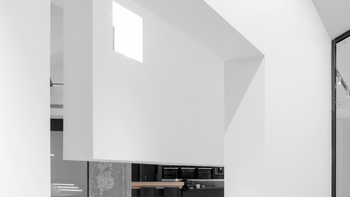
空间“自然化”处理,主要有白色艺术漆、黑色黑板漆、不锈钢线条、烤漆面板、水磨石五种材质组成。
The space receives its “naturalization” treatment, which involves mainly white art paint, black plate paint, stainless steel lines, lacquered panels, and terrazzo made up of five kinds of material composition.
▲接待区reception area
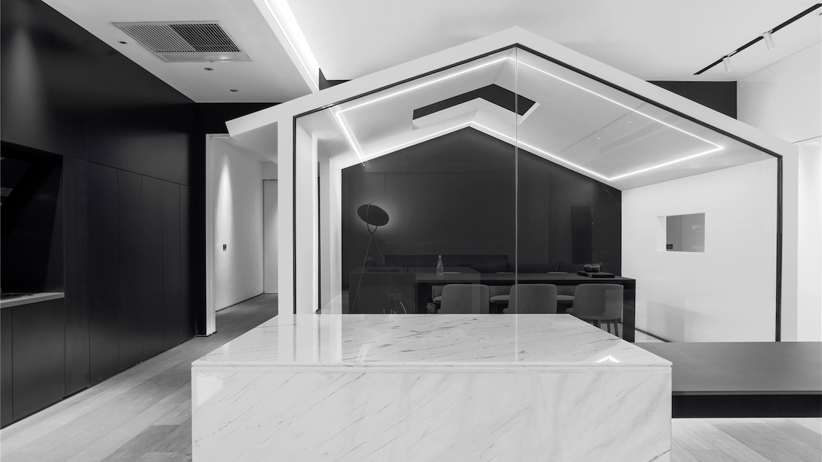
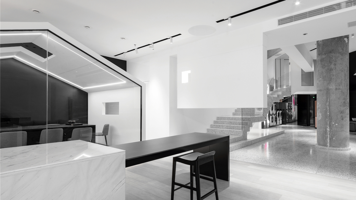
吧台简洁的丁字形设计,钢架方管的内部结构处理,让这个3.2米的吧台显得特别轻盈。亮面雅士白大理石的烧水台面,与毛面进口岩板的组合,多了几分细节和质感。黑白对比,省去了多余的修饰,感受当下简洁干净的颜色、配以线性LED灯带让整个空间的前卫感和律动感。
The bar’s clean, butternut-shaped design and the steel-framed square tube interior structure treatment makes this 3.2m bar especially light. The combination of glossy Yashish white marble water boiling countertop and rough imported rock slabs adds a little more detail and texture. The contrast of black and white saves the unnecessary decoration to allow the feeling of the current clean and simple color, with linear LED light strips that make the whole space avant-garde with rhythm.
▲有间屋YOUSPACE
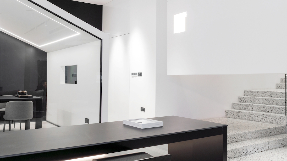
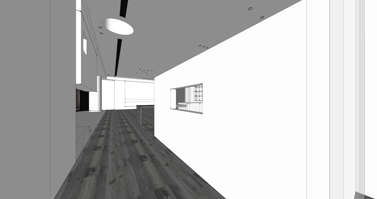
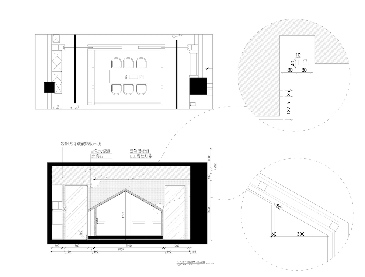
空间里的白屋设计,避开了把空间直接强行划分,保留区域属性的前提下加大上半空间的通透性。白屋抬高处理,让行走过程多了些仪式感,白屋子可做办公室也可以做茶室。白屋的线性灯带倒影在透明玻璃上的时候,有一种特殊的边界感。透过一个400*700的窗洞再一次产生的空间的互动光系。吊顶上面的开窗处理,为了大空间的光线的引入,和空气的流动。
The design of the white house in the space avoids forcing the space directly into divisions, and increases the transparency of the upper half of the space on the premise of preserving the properties of the area. The white house is elevated to make the walking process more ritualistic, and the white house can be used as an office or a tea room. The linear light strips of the white house have a special sense of border when reflected on the transparent glass. The interactive light system of the space is produced again through a 400 x 700 window opening. The window opening above the ceiling is treated for the introduction of light into the large space and allow the flow of air.
▲过道 passageway
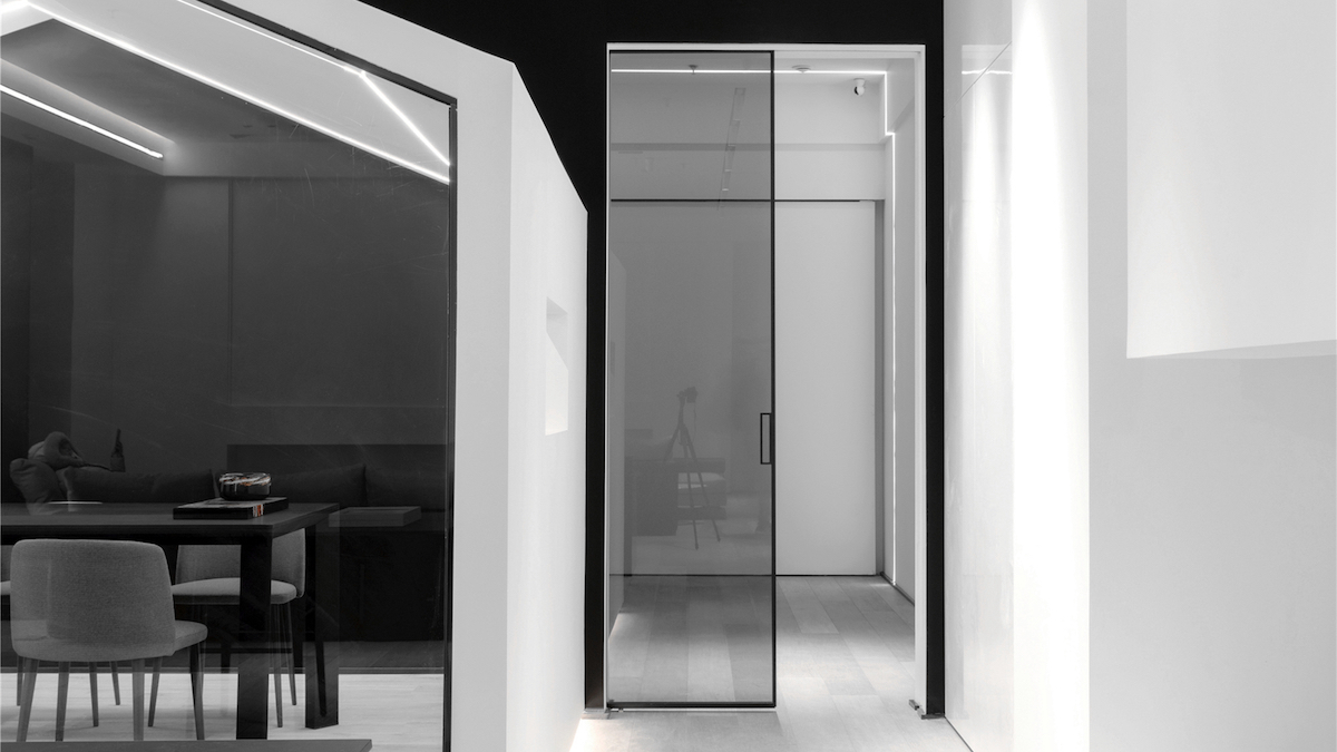
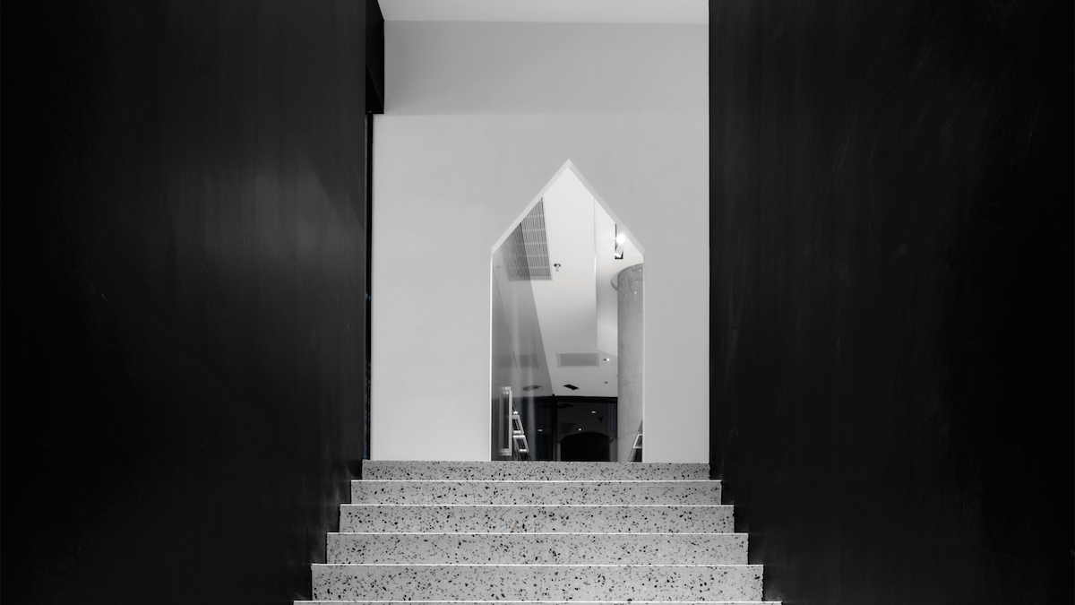
两边独立又似乎对称的过道设计,考虑到VIP接待室的人员双向动线性。白屋就像是过道里的一道风景,不经意间触动人心。对品质空间的思考,用冷静和艺术的方式表达出来。无论是结构还是装饰,都应该在真实的生活场景中拥有生命。空间的“自然化”和“多属性”是一值得思考的话题。
The two independent and seemingly symmetrical aisle design considers the bi-directional movement of people in the VIP reception room. The White House is like a landscape in the corridor, which touches the hearts of people unexpectedly. The thought of quality space is expressed in a calm and artistic way. Both structure and decoration should have life in the real-life scenes. The “naturalization” and “multi-property” of space is a topic worth considering.
▲vi图
最终我们呈现了一个可以展示陈设、可综合办公、可商务接待、可艺术交流,的多组合场景空间。
In the end, we present a space with multiple combinations of scenes that can be displayed and furnished. Its uses vary from integrated office, business reception, and artistic communication and more.
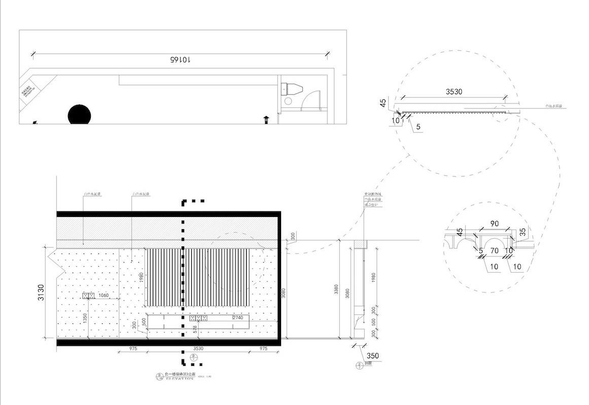
▲立面图
当空间的体验感变成一种享受,空间美学,生活美学,就慢慢融合一块了。
When the experience of the space becomes a sense of enjoyment, the aesthetics of the space and the aesthetics of living will slowly merge into one piece.
▲平面图
项目信息——
项目名称:YOUSPACE
负责单位:福建天汇设计工程有限公司
建设时间:2019年6月
项目面积:700M2
设计机构:福建天汇设计工程有限公司
项目总设计:游小华
结构设计:欧阳
艺术设计:李京
视觉设计:许骆英
施工单位:天汇精工
project information——
Item name: YOUSPACE
Responsible Unit: Fujian Tianhui Design Engineering Co., Ltd
Construction Time: June 2019
Area: 700 M2
Design Organization: Fujian Tianhui Design Engineering Co., Ltd.
Project Design: You Xiaohua
Structural design: Ouyang
Art Design: Li Jing
Visual Design: Xu Luoying
Construction Unit: Tianhui Seiko


